Makeover Monday: Hannah’s Living Room

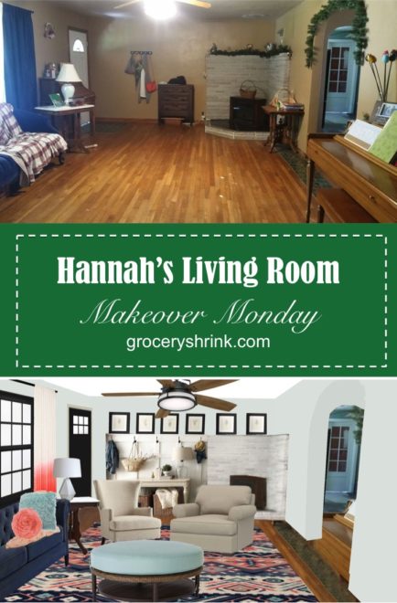
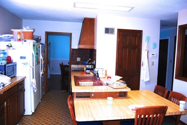
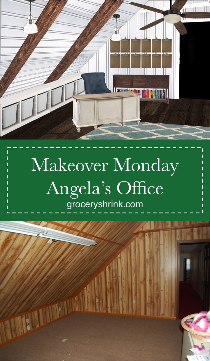
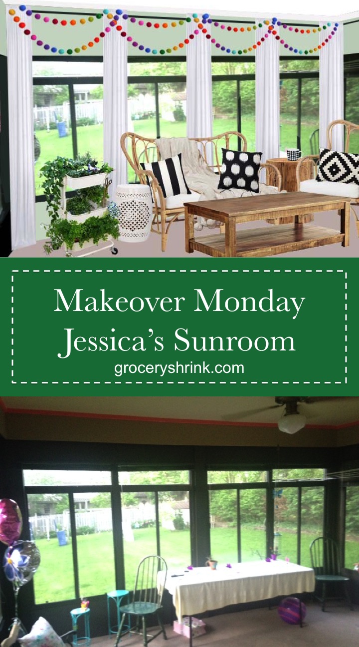
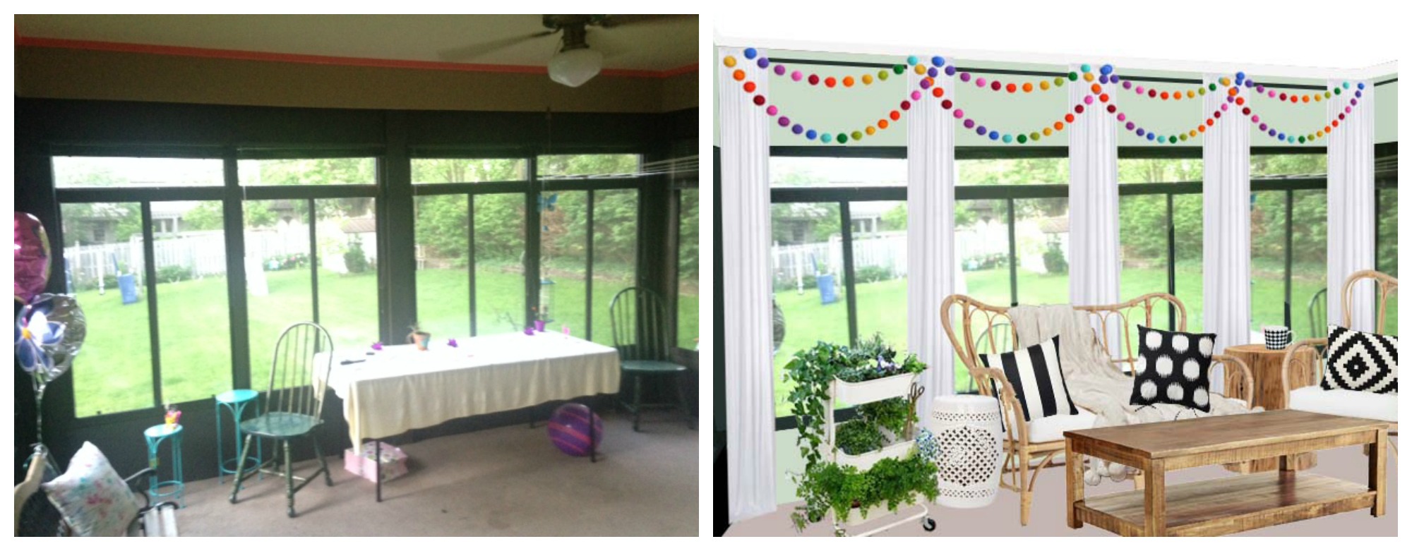
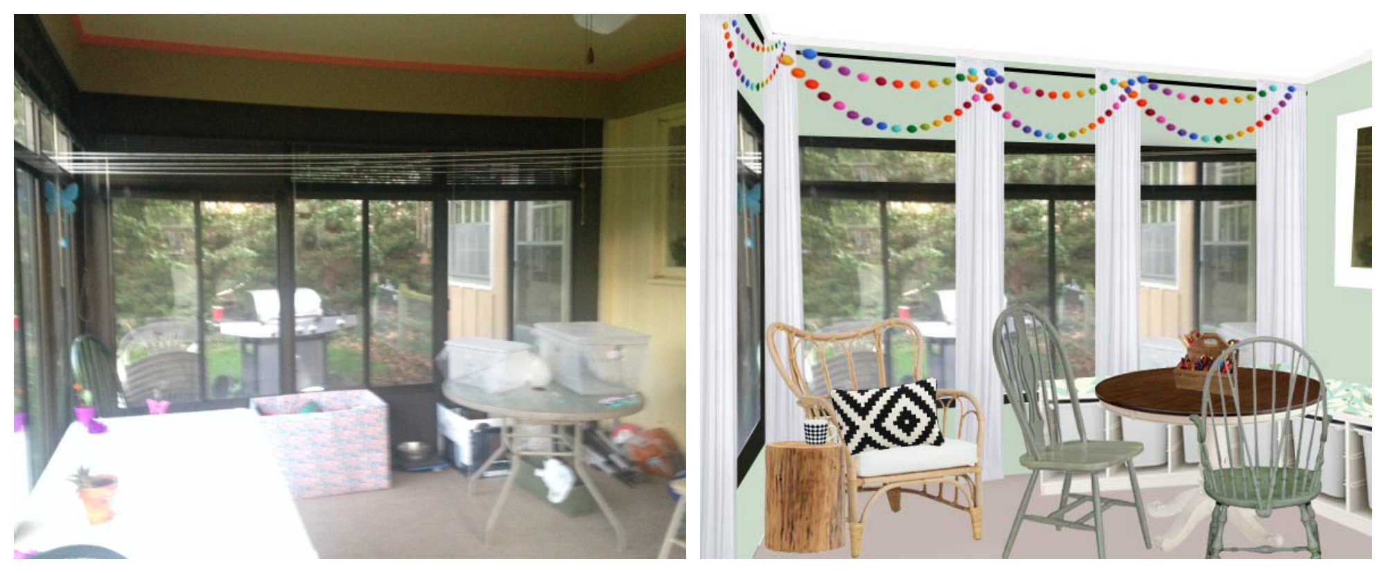
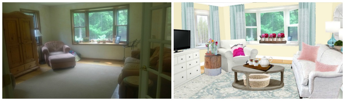
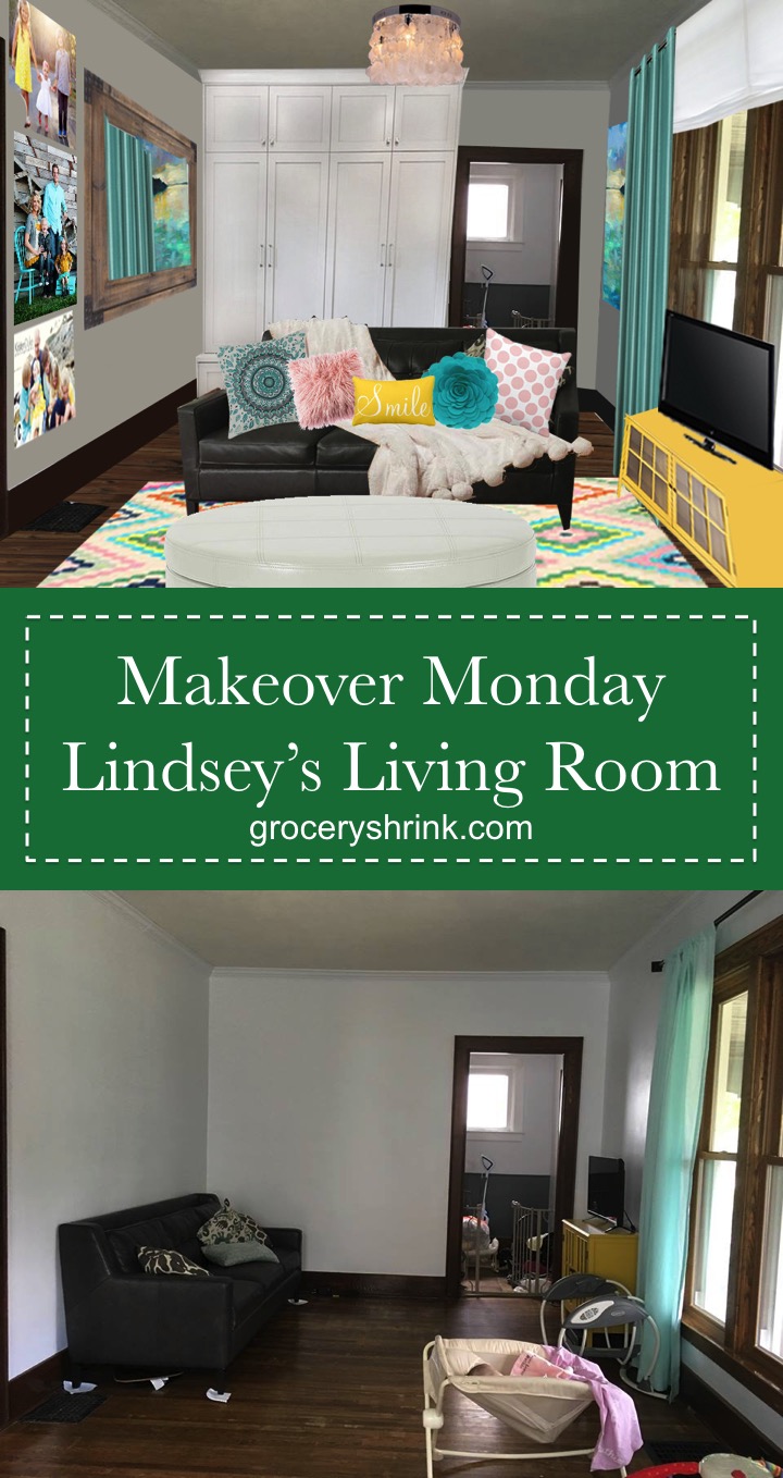
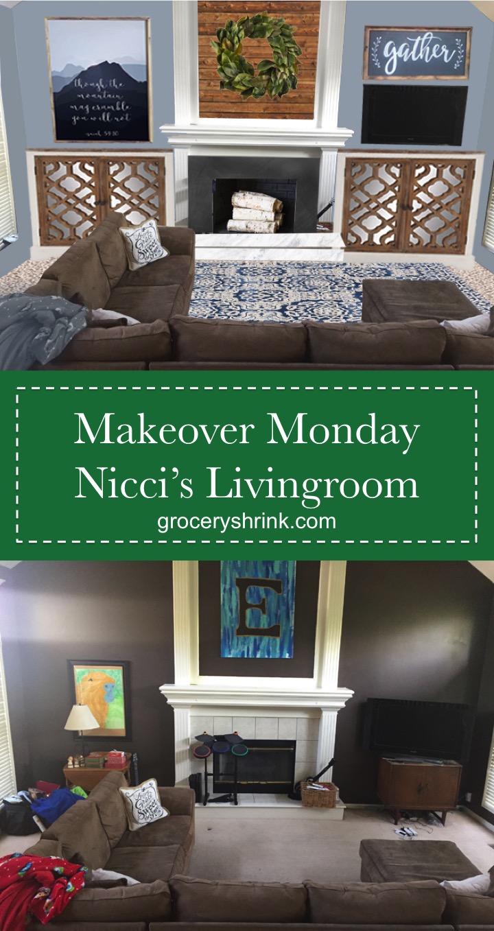
Hello!  Makeover Monday is my FAVORITE post to do and it has been way too long.  If you would like to have one of your rooms featured on Makeover Monday, send a photo to angela@groceryshrink.com and a link to your decor pinterest board.  Clutter is no problem, but keep in mind I show a before picture on the post.  We won’t judge but I want you to feel comfortable.

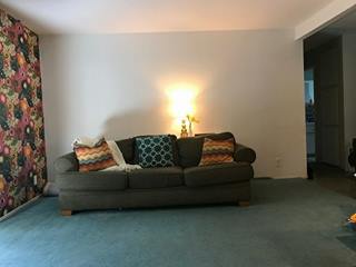
Hannah is a childhood friend of mine.  Her parents were instrumental in helping Darren and I form our relationship that eventually led to marriage.  So when she reached out on Facebook for help making her new home reflect her style, I was excited to help.

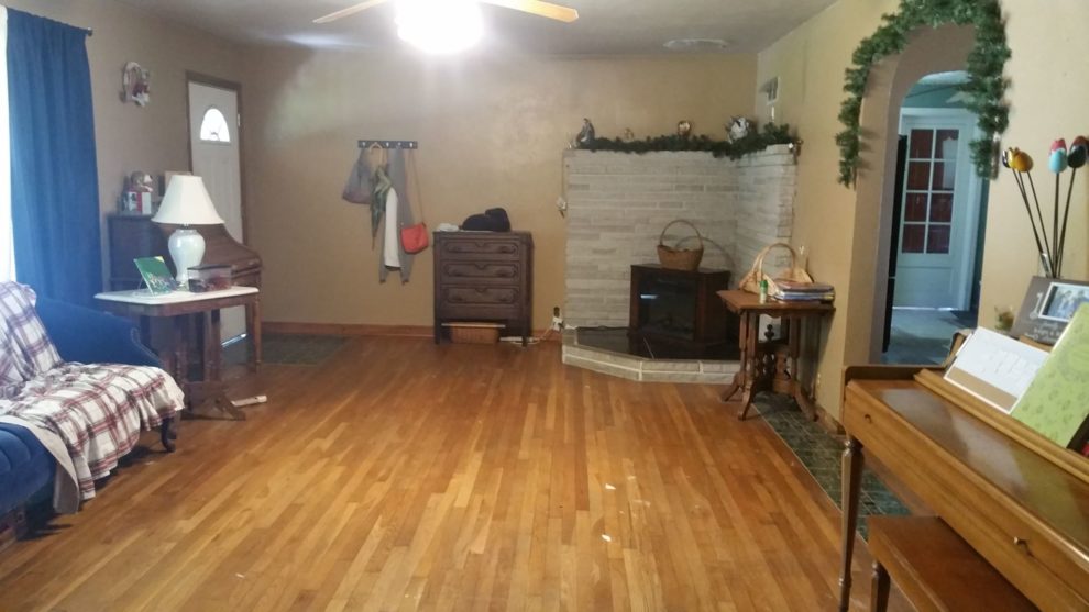
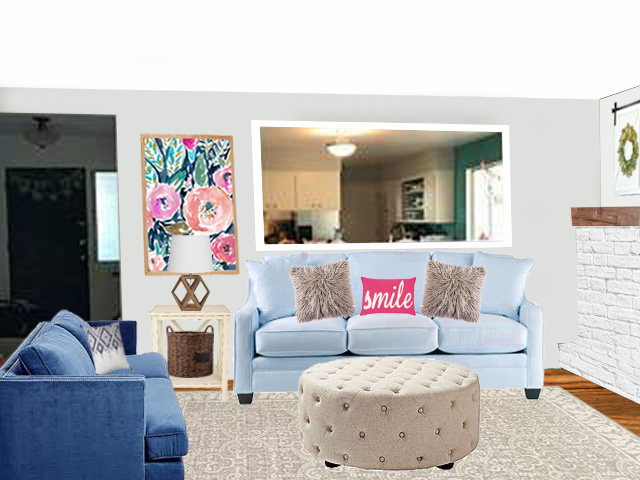
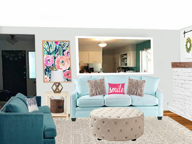
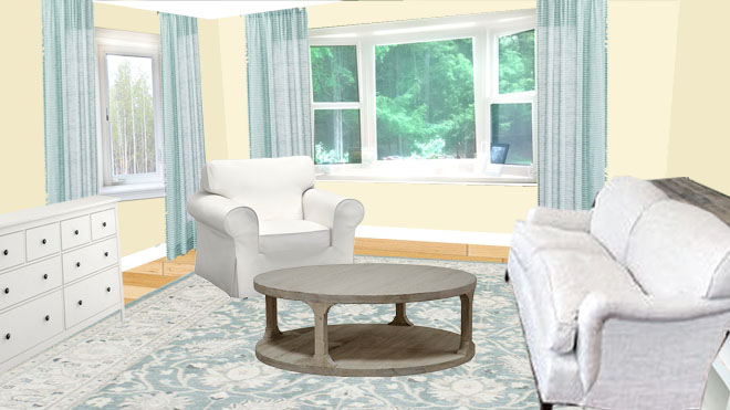
She mentioned that she wanted to lighten up the space, but not with white walls.  Her Pinterest board for the room was full of this color palette.

Source

Here are the best parts about here room:

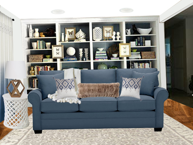
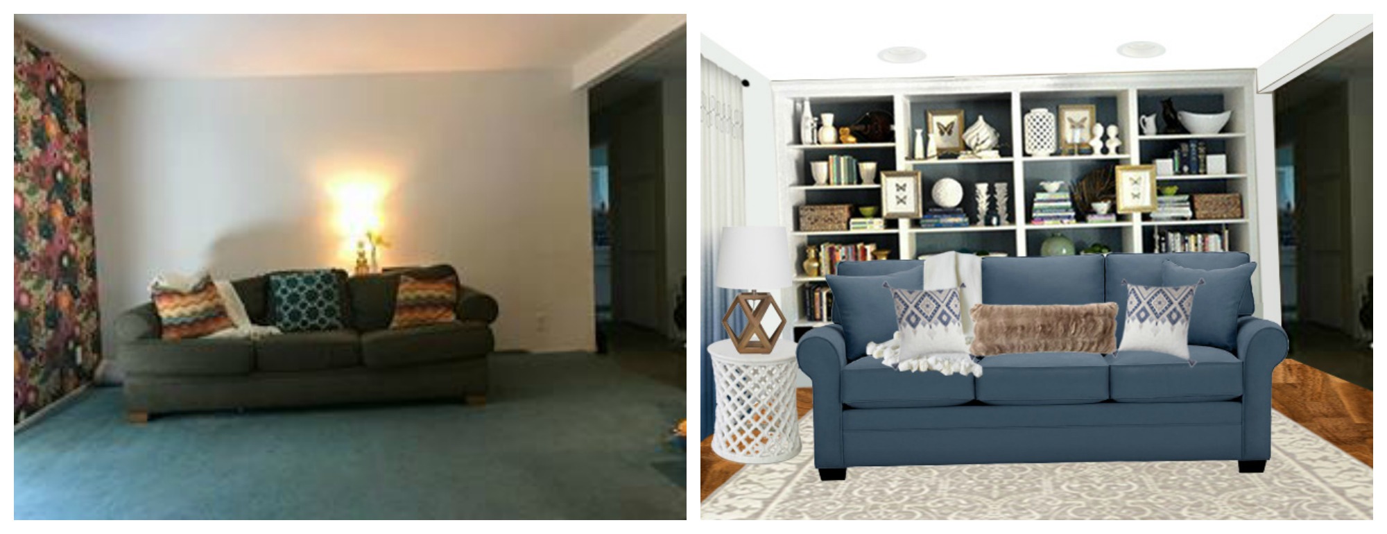
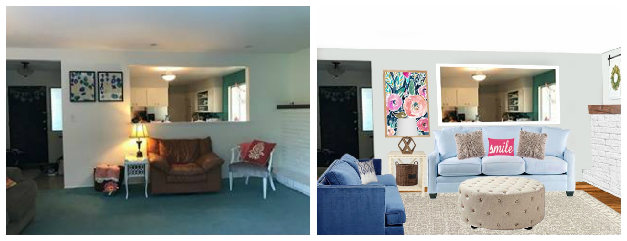
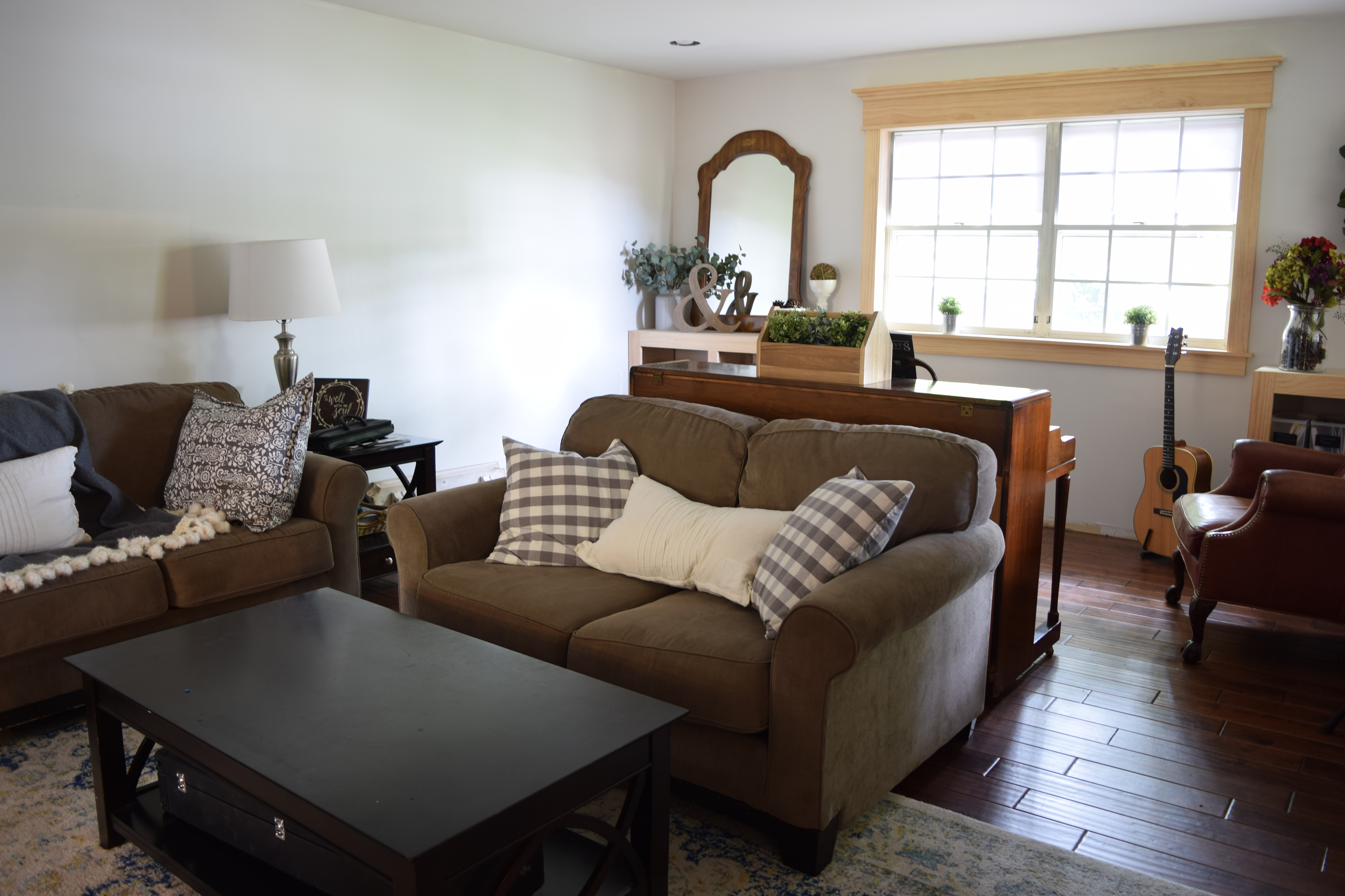
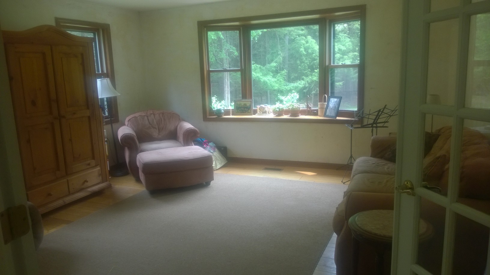
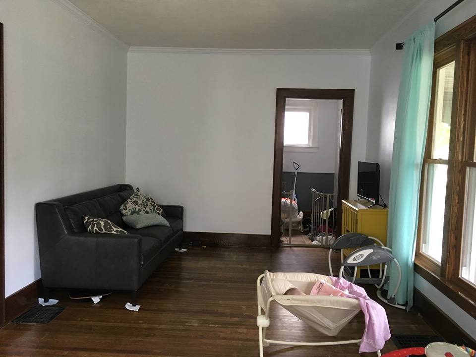
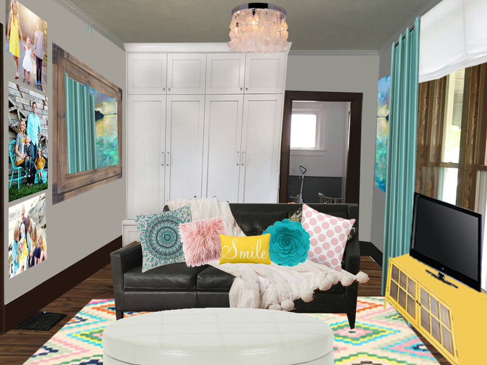
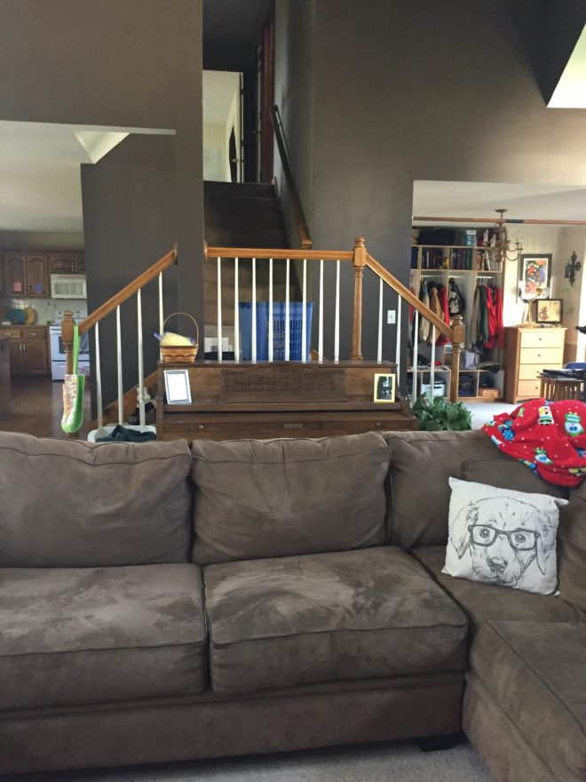
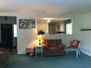
  1. Her sofa and love seat are already a beautiful navy with great lines.  Her puppy damaged the large sofa significantly and she was hunting for slip covers since replacing it wasn’t in the budget. With the lines on it, I recommend finding as close a match as possible to the fabric and hand sewing a patch on it, then strategically draping a throw over the spot.

2. Her antique side tables! The one with the marble top is especially beautiful.  They belonged to her husband’s great-grandmother and deserve to stay.

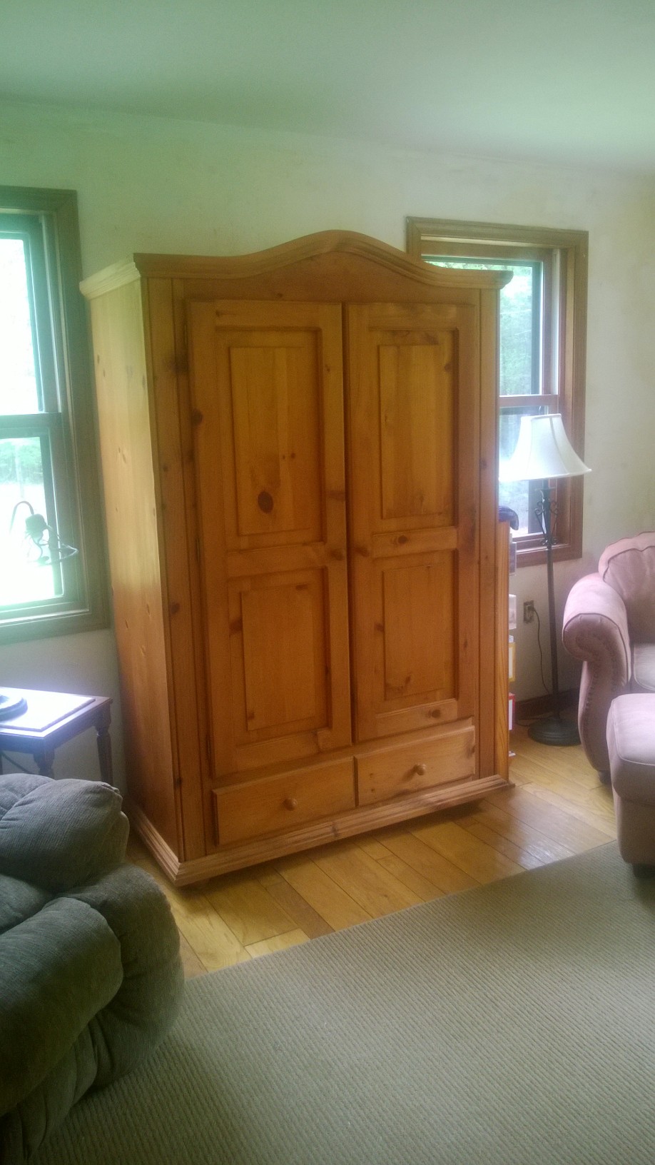
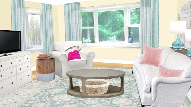
3.  Her ginger lamp is classic and large enough for the space.  An updated lamp shade shape will bring it into the modern trend.

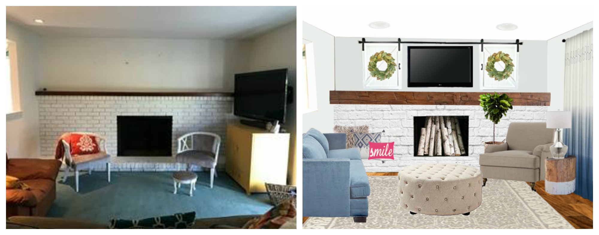
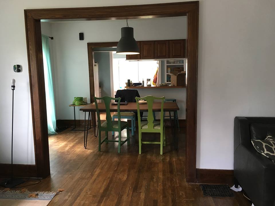
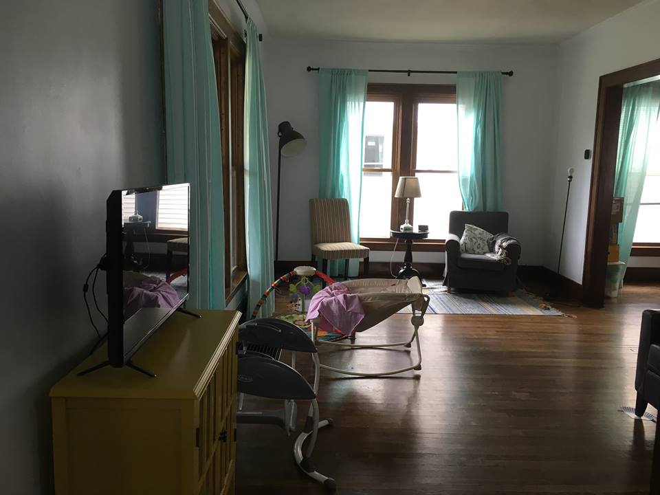
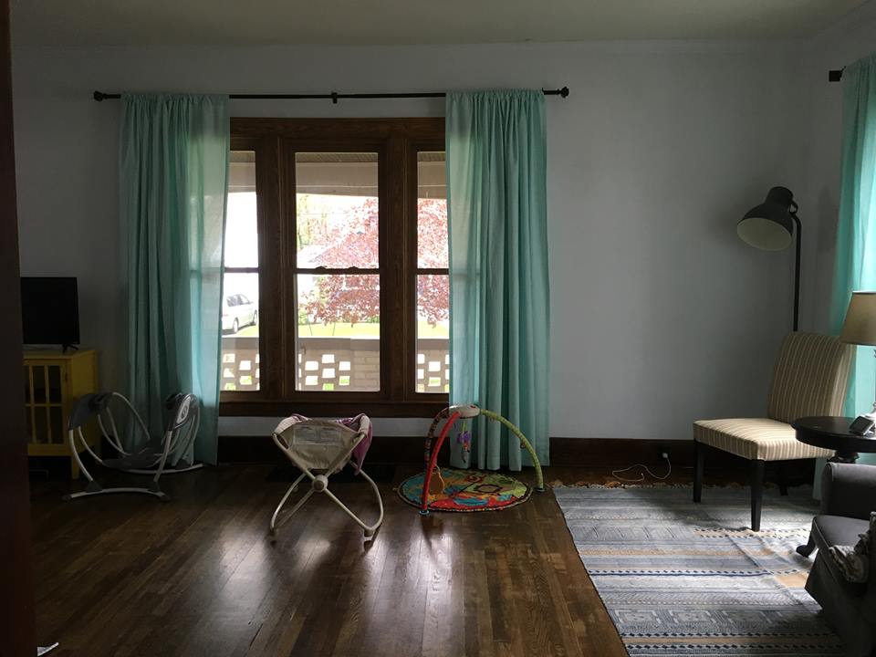
4.  Hardwood floors!  A previous owner glued a strip of hunter green vinyl between the dining and living rooms and another piece at the entry.  Plus they spilled a large amount of fingernail polish.  When she can budget enough to have them sanded down and refinished (minus the vinyl,) that’s the way to go. But still it’s such a blessing to have hardwood.

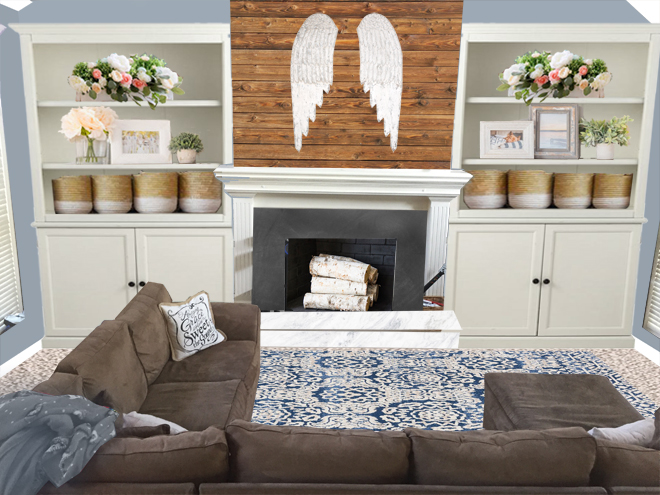
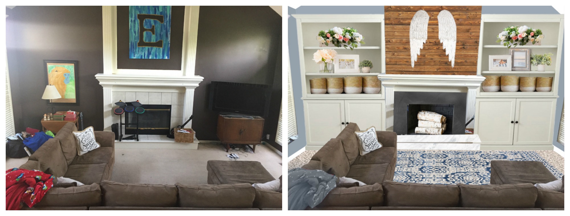
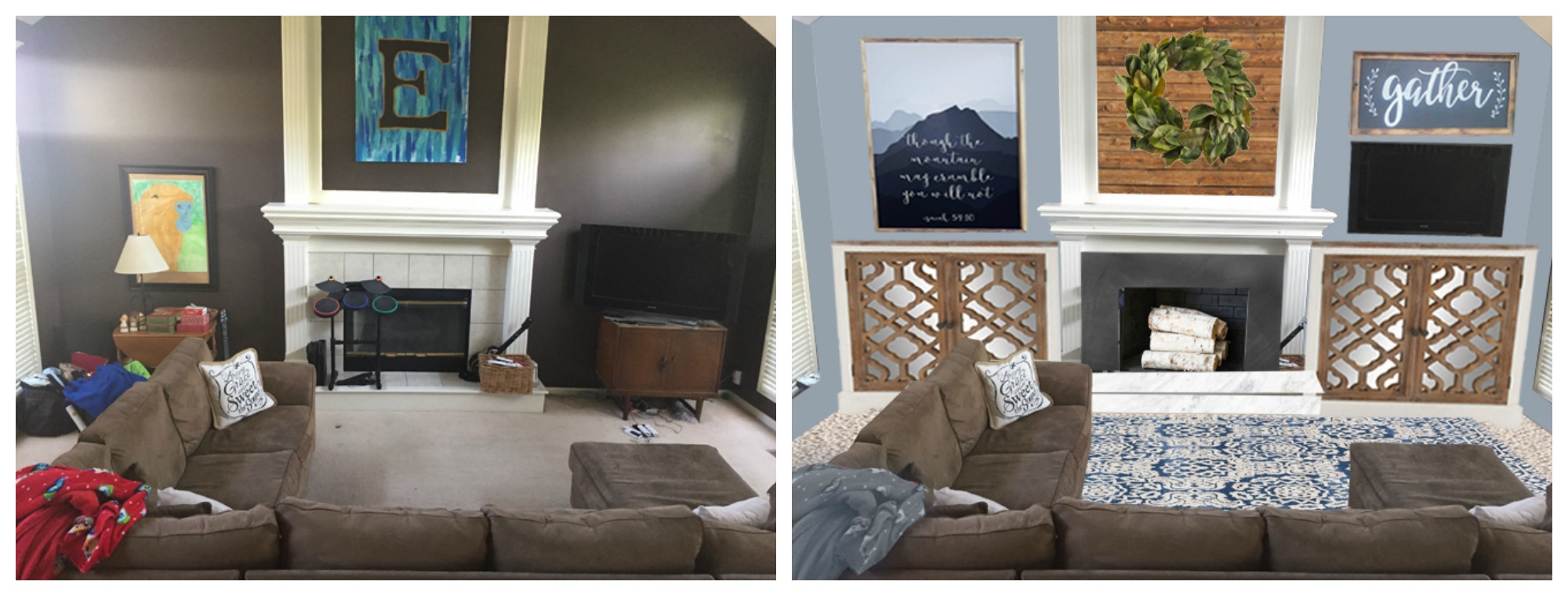
5.  It’s a huge room with so many options for arrangement and storage.

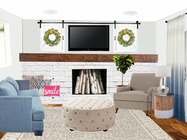
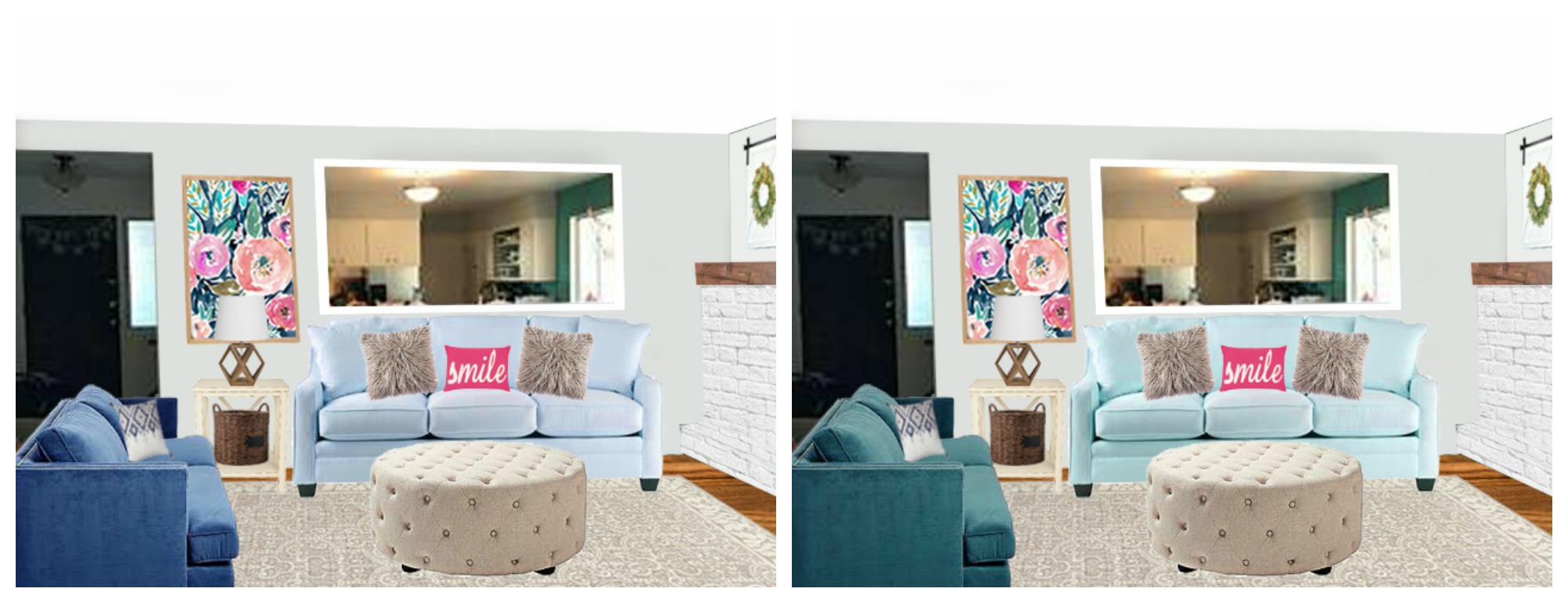
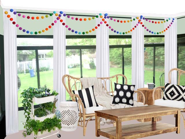
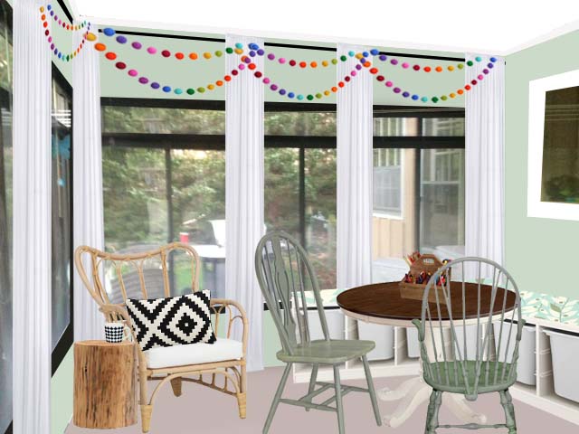
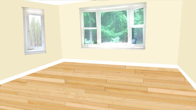
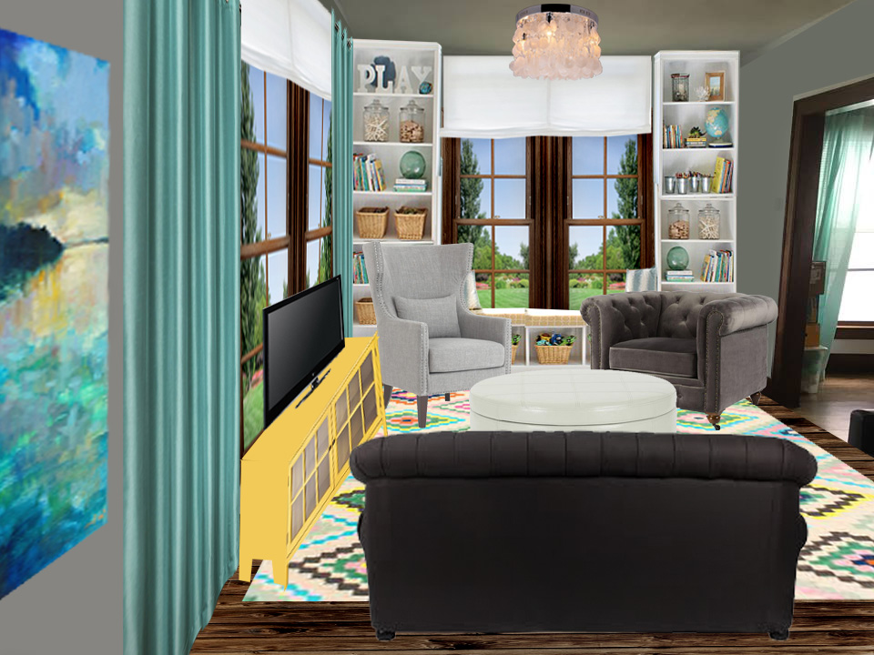
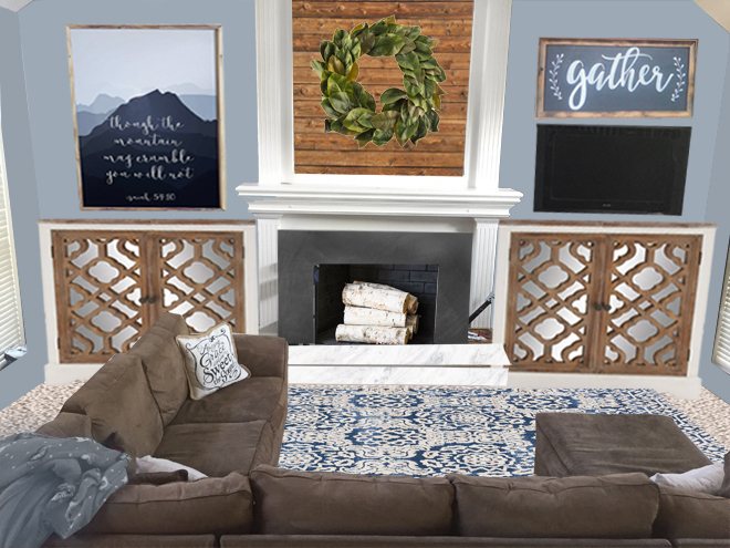
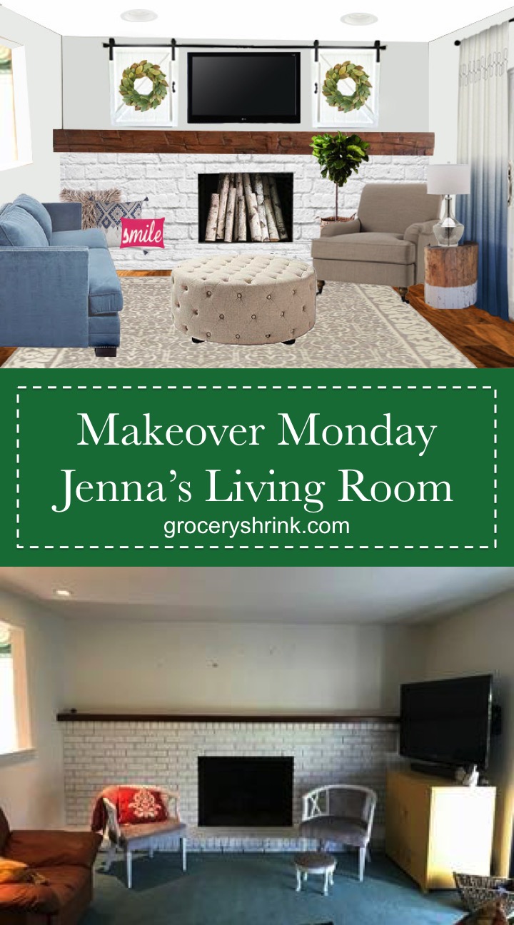
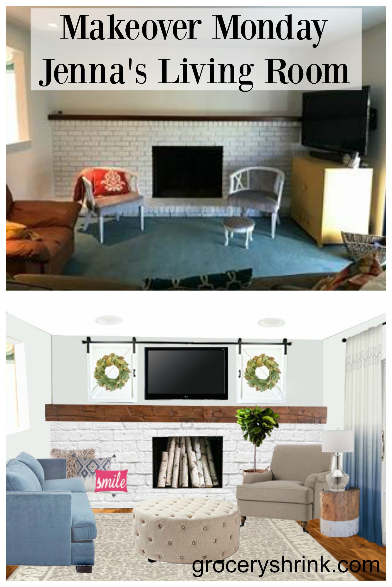
For her paint color I chose Glimmer by Sherwin Williams.  It’s a gray/green/blue that will brighten up her space and give it a calm vibe.  Putting wood tones in the room will keep it from feeling too cold.

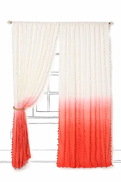
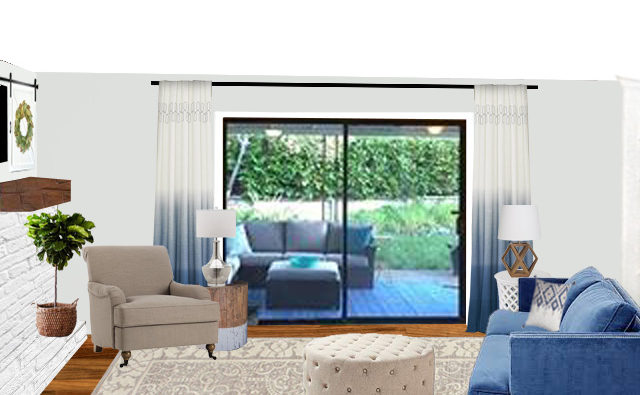
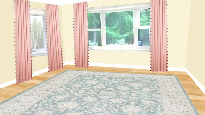
The curtains that are perfect for her space are unfortunately a discontinued pair from Anthropology.  She can search for them on Ebay, or get a similar look by dip dying a pair of white curtains. Ikea has several great selections and they all come long enough.  The trick to making curtains look like a pro did them, is to hang them as high as possible (but still touching the ground) and wide enough that they don’t block any of the glass and natural light.  This is a little tricky, because you need enough fullness at the sides that it looks like you could cover the whole window with gathering and it needs to be wide enough even pushed open that it’s not bunched up super tight.

Most curtains at Walm-mart or Target come 84 inches long and that’s not long enough for ANY room.  Look for at least 95 inches long, longer if your ceilings are taller than 8 foot. For privacy, I recommend these shades in snow drift.  They disappear to a 1 inch band when pulled all the way up.  And in her case, I’d paint the band black to make them completely disappear into her black windows.

Source

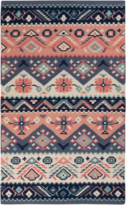
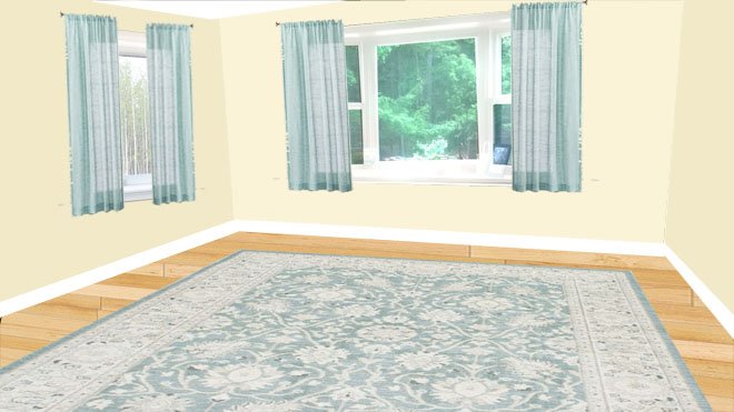
This rug is from Rugs USA and is a flat woven wool rug.  I love how wool has vibrant colors that last and wears well for many years even with heavy traffic. The drawback is that food coloring will stain it permanently. Something I learned the hard way when my kids ate popsicles over my rug. (No more artificial food colors at our house for many reasons!)

An area rug is essential even if your room has carpet, but that much more so if it doesn’t.  A rug grounds a space and makes it feel cozy and connected.  The biggest rug mistake I see, is getting one that’s too small.  8×10 is about the smallest that should go in any room (unless the room is smaller than 8×10.)  At the minimum all the front legs of the furniture should be fully on the rug.

Source

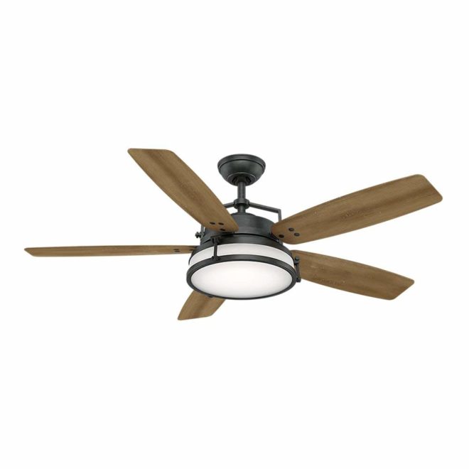
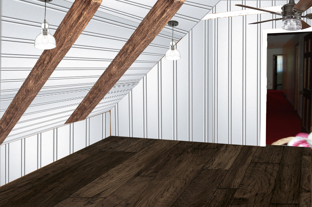
Lighting is an often overlooked way to set the stage for the style of the room.  Ceiling fans are usually a quick way to kill style, but in the southern midwest they are a necessity to get through the hot summers, even with central air.  This fan combines the best of style and efficiency and is a nice BIG size for her nice big room.

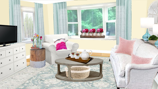
Scale is such an important part of good design.  I snagged a new to me coffee table from a garage sale Saturday and it is quite a bit bigger than my old one.  I was shocked how my better my room looked with the larger table.  The old one was just the wrong scale.

Source

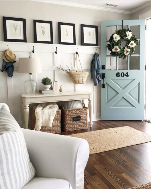
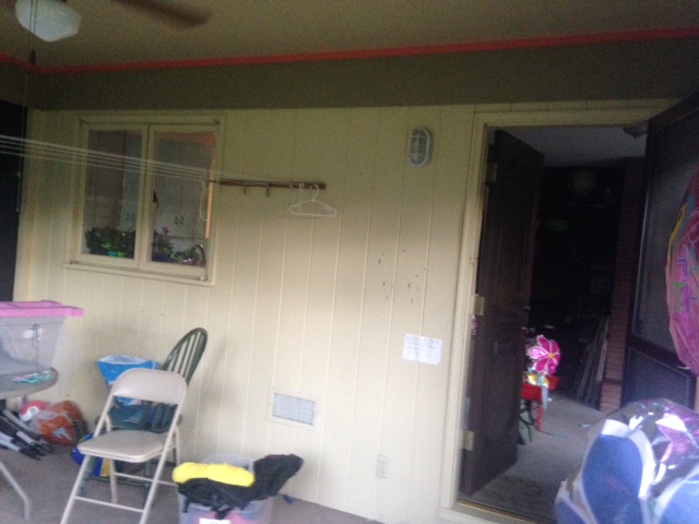
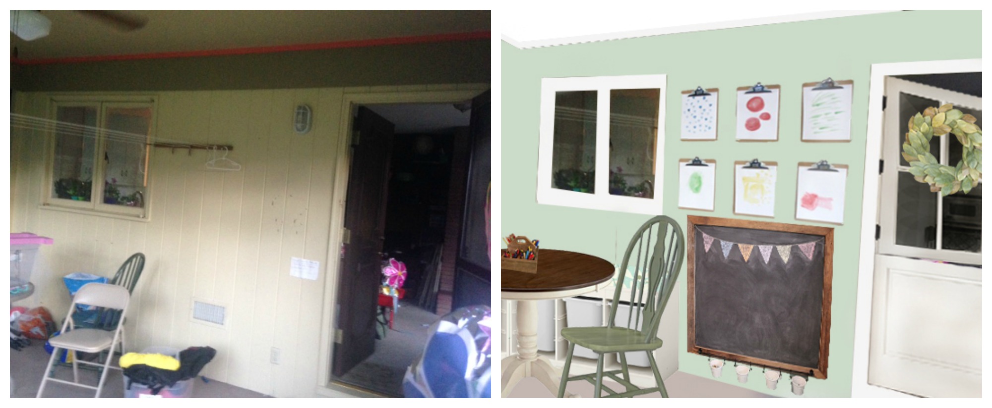
When I was looking at her hooks by the door, scale was the first thing that jumped out at me.  Her small little hook rack looks like it’s half apologizing half trying to hide.  She doesn’t have a foyer in her home or a front closet, so she gets to embrace the chance to have a beautiful exposed hook area and let it truly shine.

I recommend that she uses a board and batten wainscoting treatment on her wall, then putting hooks directly into that.  Her door is right next to the wall, but I would extend the board and batten all the way to the corner (there wasn’t a good way for me to illustrate that in the after photo so imagine it ;). )  I wouldn’t start the hooks until just beyond the point when the door is swung open.  Then use a nice large hall table or bench there to designate a proper entry way for her home. @BlueBarnCottage on instagram is the source for this part of the photo.  Her feed is a must follow!

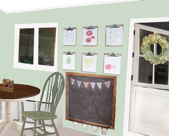
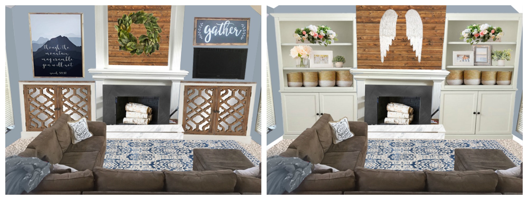
The other perfect part of this entry are the black frames going across the wainscoting and continuing on along the brick of the hearth corner. This keeps the brick from breaking up the wall and making it look too short.  With the wainscoting the same height as the brick and the pictures going across the top it looks like one continuous line.  The example has botanical prints in it that she can print for free here.  But black and white family photos would be another great option.

To help delineate the entry even more, I arranged two chairs to create an entry hall behind them.  They are open enough that you can walk between them, unlike placing a sofa in this spot. This arrangement also brings the seating area closer together.  When arranging furniture the seats should be close enough that you can still hear each other talking softly. All the seats should be able to reach the coffee table or a side table, and if you can lean forward and hold hands with your guest to pray for her, it’s close enough.  Don’t feel like your furniture has to all be along a wall.  Pull it forward, let it breathe, and create an intimate gathering place.

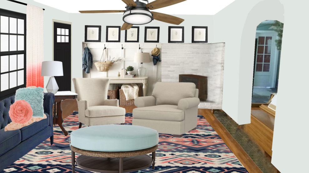
Painting her front door and window black was a bold move for me.  I usually prefer white in these spots so your eye travels outside without distraction, but when I did a side by side of black or white frames, the black was the clear winner.

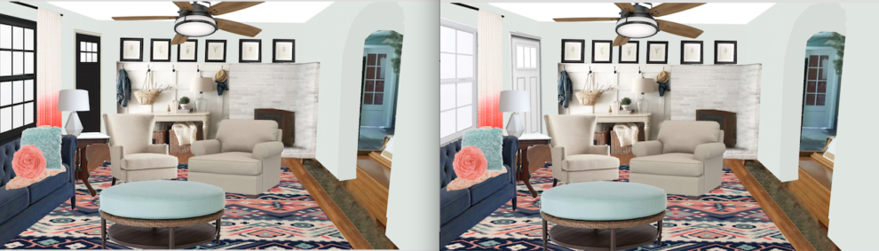
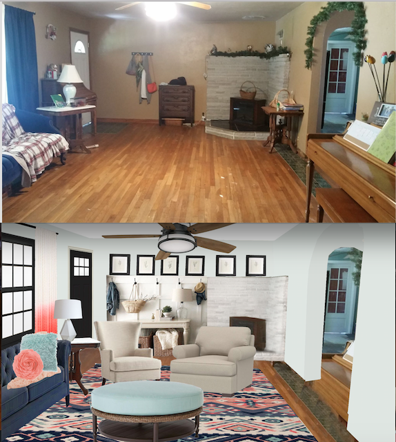
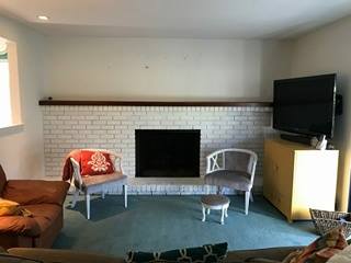
Just for giggles here’s a before and after right next to each other.

What do you think?  Would you ever paint your door and windows black?

P.S. A note for Hannah: It didn’t show in this picture, but I would move your piano to the wall where your love seat currently sits.  And if you’re feeling brave, paint it one of the colors from your palette.  Then pull your love seat opposite of the two chairs, up close so the corner of it is near the corner of your sofa and it can enjoy the use of the round coffee table too. (I’m not sure if the dimensions will work here but to work there should be about 3 feet between the piano and the back of the loveseat, when the bench is pushed in.) Then I’d put your other antique side table in the little corner made by the sofa and love seat.  If you use the roll-top desk, put it on the wall where your piano used to be.


Makeover Monday: Angela’s Kitchen

It feels a little silly writing a kitchen makeover post for myself, when we just gutted and redid our home about 4 years ago.  My mom is having a hard time imagining that I would consider painting 4 year old cabinets, when she wouldn’t dream of painting her 40 year old cabinets.  I can see her point, though I don’t share the guilt over painting good wood that she feels.

The kitchen in 2012 when we bought our house.  The door you see straight ahead is the old pantry, which I loved but removed anyway.  The blue top and gray bottom is the old dining room, which became the new kitchen.  Right through the doorway on the left, we cut an arched doorway in the dining room wall to create the entrance to the new laundry room and pantry. 

The kitchen in 2014 with the camera standing about 10 feet to the right, but pointing the same direction.  We removed several walls, and pushed the kitchen to the old dining room area making a large open space. Since this photo was taken, we’ve added the fridge cabinets, and crown molding.  Both tables are folding tables being useful while we save up for real furniture. 

A good friend told me, “Don’t ever feel guilty about painting something you hate.”  And while I definitely don’t hate my cabinets, I don’t love them either.  We ordered from CabinetGiant.com, because of their amazing prices and great quality and because we didn’t have an IKEA at the time or any hope of one coming soon.  (So glad to be wrong about that one.)  The doors, when they arrived, didn’t match the sample. They were much more yellow based in tone when we were expecting a brighter white with some glazing depth.   At the time, I had been without a kitchen for a solid year, cooking on an electric skillet and in a crock pot for a family of 8, and never eating out.  I also had a couple of toddlers, while trying to homeschool a struggling fourth grader, and teaching part time at a private school.  I was undone. Yellow cabinets were the least of my worries, so we put them in.

The kitchen today, quieted and the folding table island removed.  The thing that glares at me most about it, is the overwhelming amount of brown wood.  When we designed this kitchen, I thought the floors would be enough lighter than the cabinet lowers that it would be ok, but it’s not my favorite. 

It took me 2 years to even notice the cabinets clashed with my wall color.  At first glance it would be easier to repaint the walls than the cabinets.  The challenge is, the entire 5,000 square foot house is painted Behr Silver Drop and it’s all open concept, which means I’d have to paint the whole house to change the kitchen color. Painting cabinets started to sound easier.  Add the fact that I’ve never liked the cabinet color, and it’s a no brainer.

The whole kitchen was a compromise.  We live in the midwest, where decorating trends are a good 5-10 years behind the coastal states. So we were still enjoying the end of the Tuscan Beige era. I craved a bright white kitchen, but my husband had been dreaming of finally being able to afford a rich Tuscan Beige kitchen like we had seen in the nicer parts of town.  I didn’t hate that look, while he definitely seemed to dislike the white shaker style I preferred, so I compromised.

Then a blessing hit us, that I couldn’t see at the time.  We lost our life savings to a foundation repair which meant we couldn’t finish the kitchen. If that hadn’t happened, I definitely would have selected granite countertops that I would have hated in just a couple of years, and been stuck for decades because of the huge investment.  Instead we spent about $200 on hardwood plywood that we painted and sealed with marine poly.  They have served us for 4 years, though the seams split early on and the marine finish wore off after a few months of daily washing and they are now stained and showing signs of water damage.

I painted the plywood countertops a medium gray, hoping to bring the kitchen into the current decade, but instead it just drew attention to the fact that it didn’t harmonize.  It was a good lesson to me that if I can’t afford to fix the glaring problem, it’s better to work WITH it, then to ignore it or fight against it.

It’s finally time for us to finish the kitchen!  (Our bedroom comes first on the project list, but I like to decide on finishes far in advance so I have time to research prices and wait for sales.) Here’s our to do list:

  1. Break up all the dark wood
  2. Replace my double sink, with a huge single apron front sink.
  3. Install Countertops
  4. Install a backsplash
  5. Install a range hood
  6. Build an island with a sink.
  7. Choose counter-stools for the island
  8. To paint or not paint the contrasting crown molding.

I also may need to change the island pendant lights, but didn’t focus on that with this photoshop plan.

First, I tried navy paint on the lower cabinets and white crown, which I LOVE.  It broke up all the wood, but when I installed a white island, it gave the same affect without the need to paint all the lowers.  I’m all for less work, lol.

Here’s the same look with brown cabinets and brown crown.  I like this ok, but the stools (which I love the shape of) fight against the other wood tones and don’t relate to anything in the room. As much as I like the wood lowers better with the new whiter uppers, I still loved the navy more.  The original navy view felt a little too white, too sterile.  So I tried switching out the range hood for reclaimed wood.

I like how the reclaimed wood had parts of the dark wood color from the floors, but brought in lighter wood tones too.  Then I thought I’d switch out these expensive stools that didn’t quite blend with the floors, with some low profile stools for 1/3 of the cost.

They are ok, but I’m going to look for a third option in a color that’s a perfect blend of the two, a lighter wood like the hood, that plays nicely with the redder floor tones.

The last thing I wanted to try was painting the crown navy to match the lowers instead of white to match the uppers.  The risk is making the room feel short again. It’s 18 feet wide, so short ceilings are a minor issue.

While I like this, I think I like the open airy feeling of crown that matches the upper cabinets better.

This exercise has me itching to paint right now.  I’ve had the upper cabinet paint on hand for over a year already. But I promised myself I’d finish some of the other projects I started and didn’t finish, like painting the foyer, first.

If this were your kitchen, what finishes would you pick?

Sources:

Navy Paint Color: Behr Starless Night

White Cabinet Color: Behr White Pepper

Island turned legs: Etsy Design59Furniture

Backsplash: 3×6 Mohawk gloss white subway tile

Countertop: Not sure on our final choice, but we are looking at Marble look quartz options.  I’m afraid the cost will be impossible.  I haven’t eliminated the possibility of a good laminate.


Makeover Monday: Angela’s Office

We hired help to hang the bead-board in my office last week. In preparation, I looked at several rooms on Pinterest which motivated me to turn the paneling the opposite direction it was hung before. If you’d like to see my pinboard for this room find it here.

Those inspiration pins also encouraged me to make the wood we need to use to hide the seams wider and thicker so it would look like structural beams. We had originally planned to make it all white and subdued, but the photos with contrasting wood beams really caught my eye.  To make sure that was what I wanted, I drew an inspiration photo in photoshop first, and tested out some lighting options too.

Using photoshop to test out wall covering options

Here’s what it looked like before:

Read more

Oops, I meant to just drop off a donation

This decade of our lives, I’m calling our “construction phase”  has left me searching for ways to make the house feel put together and comfortable enough for guests, even though most places don’t have baseboards, outlet covers, real furniture or paint.   While we’re earning a living and enjoying our family we’re also dragging this whole remodel thing out.   I’ve finally made peace with it.

Last fall I started building bookcases with doored bottoms and hutch tops.  You can see more about that here. I got the bottom frames done before our garage sale.  Then I put away my wood working tools to clean out the garage for the sale.  Here we are a year later and I finally drug everything back out and cut the middle shelves.  In the mean time, I styled the tops of the unpainted, undoored cabinets like they were supposed to be just the way they are.

A few weeks ago, I dropped off a donation at the thrift store.  I meant to just drop and go, but way up high on the back wall there was a HUGE mirror with a nicely arched top.  I took one glance and thought, “That’s way out of my price range.”  I turned to go, but my heart wouldn’t let me leave without touching it.  I felt a little guilty asking the woman at the register for help to get it down, since I knew I wouldn’t be buying it. It was lighter than I expected.  The frame was made to look like wood but was molded plastic.  I looked for the wax pencil marking on the back….$15. What?!!!!  Sold.

I meant to paint it, to cover up the off center 1970s decal at the top.  But from a distance the darker wood warms up the space and the decal is hardly noticeable. It’s so much easier to love it how it is #lazybutton.

  1.  The lower half of the built ins hold my music.  Each file box is labeled with chalkboard tape and a wet erase chalk marker with things such as “voice lesson” “Trios” “Christmas music” etc.  Doors will eventually hide it for a less cluttered look. The left side is for vocal music and the right side is for instrumental music. We are using these plans from Ana-White and Shanty-2-Chic, just narrowing the dimensions to fit our space.
  2. The vase and stems are from Ikea.
  3. The wood ampersand is from Hobby Lobby.  It is 50% off at least one week each month.
  4. The tall candle holder is from Big Lots and the small bowl is a planter from a thrift store. I filled the bowl with found pinecones and the candle holder holds a large moss ball from hobby Lobby.
  5. We made the wood trim around the windows from 1x select pine boards from Home Depot.  Using this tutorial from iamahomemaker.com and this one from Blesserhouse.com.  We put an extra board on the top of the windows to beef it up a little, but made sure to leave room for crown molding.
  6. The wooden tool box and 3 faux plants inside are from Ikea.
  7. I made the magnolia wreath, tutorial here.
  8. The leather chair is a find from Craigslist.  It belongs in my husband’s basement office after I refinish the leather into a better color.  But the office is too big of a mess to hold it even temporarily right now, so it lives here.  Our piano teacher has a comfy seat waiting for him when we start lessons again :).
  9. The pom pom throw is a DIY crochet border added to a cheap Ikea throw.  Tutorial here. Plus every single pillow and cover is from Ikea, because I’m addicted and they are affordable, comfy and cute.
  10. The rug from RugsUSA also belongs in Darren’s basement office, but it’s living here for now.
  11. This is our old music storage system, a lateral file from Home Depot.  I have too much music for it now, and it’s destined to be painted and live somewhere else at some point. I’m in process of organizing and moving the music in it to the new file boxes–hence the stacks everywhere.  The white baskets underneath are from Target. There’s one for each child to hold their music books for lessons, but the system has become corrupted. They now hold the music I’ve been too lazy to put away properly and need an overhaul.
  12. These lamps were a garage sale find and had too small shades.  I grabbed some cheap new shades at Ikea and upped their impact.  I’m tempted to paint the bases also, maybe a nice deep navy.

For help decluttering, reorganizing and styling, you should check out Havenly’s Design Services.

As I was writing down all the sources for these products, I realized how overwhelming it can be to put a room together.  I’ve gathered these items over the course of 6 years, just one piece here and there using my little monthly home budget and money I earned at our annual garage sales.  Nothing about the room is the way I want it to be permanently, but it’s functional for now and even pleasant to sit and visit with a friend there.

How about you?  Is there any room in your home that isn’t quite finished but is good enough for now?  Or tell me about a time you used something you already had in a new way to brighten up a space.

Why we didn’t buy the floor

Oh Friend, I’ve struggled a bit in writing to you.  I’ve been wanting to find something that truly benefits you instead of just sharing what’s on my heart, and every post I’ve started this week has put me to sleep.   So back to my heart it is.

Remember 18 months ago, when I shared some inspiration photos about our basement here and here?  Well, I finally starting tearing the walls down to start the process.  Specifically this one beside the stairs that will become the kitchen area:

I was proud of myself for disconnecting the light and switches :).  Next I need to learn how to shut off the water and pull the sink out.  In the new plan I’d like to block off that door on the left and put a full size refrigerator there.  Right now the fridge is in the garage, but it will be much more convenient here and give us more space to work in the garage.  We’re not really moving forward with this project, but some of the demo was necessary to be able to access plumbing and electrical for our master bedroom project.  And Darren said I could move forward with any of our projects as long as whatever I did was free.

I had such a productive labor day weekend, but part of me is a little sad.  You see, the flooring I picked out for this space was almost $1 off per square foot the the holiday sale.  It’s the first time in 18 months that I’ve seen it go on sale, and I didn’t buy it.  I felt a bit of anguish at the time but it was minor compared to the disappointment I feel today now that the sale is over.  When the waves of disappointment come, I tell myself all the good reasons why we didn’t buy the floor.

  1.  We need to make sure we have enough money to finish our bedroom project.
  2. We weren’t positive that rigid flooring is the best option for the basement.  I’ve heard it’s awesome for smoothing out imperfections, but others have said the imperfections might weaken the floor and cause cracking and flexible is the better choice.
  3. We aren’t ready to install the flooring yet and at the rate we’re going it could be a year or more longer.  That means we’d have to find a place to store the flooring and hope it didn’t get damaged before we could use it.
  4. Since we need to wait to install the floor, we might find another good deal or an even better fit for our area, OR my taste my change completely and I’ll choose something else.


I’m feeling a little better now that I wrote that all down.  There were definitely more reasons to not buy the floor.  The only reason to buy the floor was saving $1,000 with the sale, but there’s nothing that says we won’t find another sale when we’re more ready.

In the meantime, I’m taking the studs and pine board paneling that is too short to use in the reconstruction phase and using it to turn this front closet into a bench with drawers.  Like this one from the House of Smiths.

To finish it all out, I’ll only need to buy a few trim boards and a piece of foam for the bench cushion.

How about you, have you ever bought something because it was a great sale and then regretted it?  Or didn’t buy something even though it was a great sale and wondered what might have been?  I’d love to hear about it.


Makeover Monday: Jesse’s Sunroom

I did this makeover in the spring, but with only 18 summers to spend with each kiddo I decided to wait to show you until now.  As I’m writing this, it’s the first official day of school and the house is empty. I have a senior!  How is this possible? And a sophomore, 8th grader, 6th grader, 4th grader, and 1st grader.  Today I walked my 1st grader to school and he held my hand the whole way.  It’s such a  privilege to share that time with him. 

Jessica’s family is quite an inspiration.  They live close to me and her husband, Brian, taught my kids violin lessons for YEARS.  My son’s first lesson, he hid under Brian’s coffee table and refused to come out.  Then screamed, “I hate you,” when we left.  Good times.  I escorted my kids to the car and came back in alone and said, “If I keep paying, can we come back?”  Brian graciously agreed and my son now plays in the high school orchestra.

That kind of patience is worth admiring, but on top of that, Jesse and Brian are rock stars when it comes to debt free living.  They paid off their small starter home fairly early in their marriage, then on a modest single income, lived there through the birth of 3 children, saving all they could until they could pay cash for a larger home in a better neighborhood.  Can you imagine being a young family with no payments?  It’s awesome, that’s what it is.

This is the view of the room standing in the back door from the living room.  It has a beautiful view of the backyard and plentiful big windows. 

If you step into the room and look to the right, you see this.

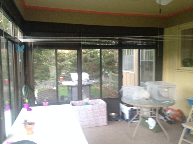
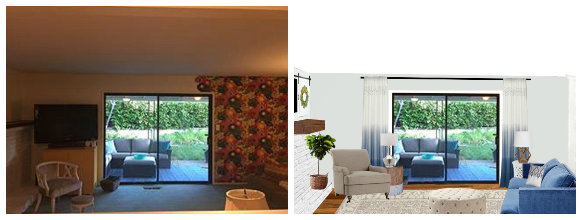
Standing in the doorway to the backyard and looking back towards the house.

This is just a shot to show you her current door.  It’s a cute shape, but we weren’t a fan of the yellow glass.  Her screen door is real wood and a very cool vintage style, but it’s always in their way.  They keep it propped open.

Jesse didn’t like ALL of the colors going on in the room.  There are 3 different shades of paint on the wall, plus a 4th for the ceiling.  AND the black windows, gray/brown flooring and brown door add 3 more colors to the mix.  Her biggest concern was all the black above and below the window was vinyl and part of the window unit.  Brian didn’t want to paint it because it isn’t drywall, but my philosophy is to never live with something you hate if you can paint it :).   Showing him a photo of how it would look painted made a big difference.

Instead of pretending the black window frames weren’t there, I encouraged her to embrace them into a mint, black and white color scheme.  I painted out the vinyl header and footer on the windows to match the walls and took the color all the way to the ceiling. Breaking up the walls with stripes of contrasting paint, like the previous owner had, only makes a room look shorter.  That kind of thing should be saved for ceilings 10 foot or taller.  I painted the crown molding to match the ceiling, but it could also be painted to match the walls.

Taking the drapes all the way to the ceiling minimizes some of the black while making the room feel even taller.  I kept them pushed off the glass to let in as much light as possible.  These drapes are just to soften the room and give a feeling of height…not to block light or the view.  A rolling cart holds an herb garden that’s conveniently close to the kitchen.  This is a space where Jesse can enjoy an iced tea with a friend while watching their kiddoes color in the art corner.

Jessica’s kitchen window overlooks one side of the sunroom.  They use the room for homeschool projects, especially art and science experiments which needed storage. I used Ikea Trofast bins to create a corner bench area and added upholstered cushions on top for comfort.  She can customize the size of the bins to the things she wants to organize there.

These are her original chairs painted a shade of green that’s slightly darker than her walls. The table is a similar shape and size to the one she had, but the solid wood top (no hole for the umbrella) and the pedestal bottom really elevates the piece.  I recommend she search Craigslist and garage sales to find something this style and to use her original table until then.

The windowless side of the room is the perfect spot for a chalkboard and art storage.  Since her children are so young, I hung the chalkboard on the bottom half of the room, with bins below to hold chalk and erasers.  Above the chalkboard, I used clipboards for easy art display.

Since they prefer to leave the door open to this room, I recommended a Dutch door.  This allows them to keep their dog in a specific area, while still giving sight lines for Mama. That screen door was precious, and I think they should keep it for a bit to see if it has another purpose for their home, but remove it from this area for now.  What do you think?

Sources:

Mineral Green Wall Paint

Trofast bench

Bench Fabric

Wool Ball Garland

Wicker Furniture

Rolling Herb Garden Cart (White is currently discontinued, but it can be spray painted.)

Stump Table

Pillow and here

Curtains

Curtain Rod

Curtain Brackets

Chalk Bins

Clipboard

Magnolia Wreath here or here or here

Some are affiliate links 🙂

Would you like your room photoshopped and featured on Makeover Monday?  Send a few photos from your space to angela@groceryshrink.com and tell me your hopes and dreams for the room.  

Get a full service virtual makeover complete with 3D room layout plan, 2 photoshop views, step by step work list, and source list–all in your budget. Find out more.

room-makeover-short-banner

Learn how to use Photoshop your own designs with the Room Makeover class.

Andrea’s Parlor

Andrea wrote to me a few weeks ago:  “I need help making my house more attractive, but have almost no budget to do so.  I am sure you can relate.  I am terrible with colors.  My house is dark. So, I’d like to lighten things up.  It had all dark trim.  I am slowly painting it all white.  I have a rather small living room which comes off of a very large eat-in kitchen by a set of French doors.  So, I need the colors to flow, since it is visible from the kitchen.  I am more of a country girl than a modern girl.  My oldest is graduating this year and we are having a cookout here.  We were so blessed to be able to homeschool him for his entire schooling.  So, I am ready for a party! I really want to spruce things up, but don’t have too much time.  It is June 17th!”

Andrea’s home is large and airy and the French doors are really charming.  Her whole main floor is butter yellow and it’s such a bright sunny color, I decided to use the same thing in her parlor.

Here is her foyer

and her dining area with the butter walls.

Here is her parlor.  She’s in the midst of a big wallpaper removal project, so it doesn’t have any paint yet.

She has done a lot of things right with her space.  First her idea to paint all the trim white is perfect. It really does brighten up the space and make it feel fresh and crisp.  She also has a nice big rug and not too much clutter.

This view shows another window on the other side of the armoire! I love how much natural light is in this room.

When I’m working in a room the first thing I do is empty it completely, then give everything a fresh coat of paint.  I know designers think of the ceiling as the 5th wall, but when it comes to a space that I like living in long term, I’ve never found anything better than a bright white ceiling to bounce as much light as possible.

When a room is empty you can see things like: the armoire was blocking the light from the far window from reaching into the room, and it was taking up space that rightfully belongs to curtains.

I decided on a color scheme of butter yellow, pale aqua, and shades of pink.  I found a beautiful rug  that will bring in the pale aqua without drawing too much attention to itself.  Then I tried it on with some fun pink curtains with tassels.

It didn’t have the restful vibe that I thought she would want, so I traded them out for an aqua set with white pinstripes and mini pom pom trim. Texture from pom poms or tassles or a woven in stripe give a design more depth. Also, curtains look best when hung as high and wide as possible. They can be closed when necessary for privacy but when open shouldn’t block any of the glass.

Curtains too low, too short and too narrow.

Long curtains hung too low and too narrow.

Curtains hung high and wide.

Ahhh, that’s better.  Her furniture looks super comfy but a little worn, so I recommend she slip covers it in white or cream.  That sounds scary but slip covers wash very well and bleach in the sun.  For the best look, sew tailored covers that have separate covers for each cushion.

Furniture looks best when it isn’t pushed all the way back against the walls.  It also needs to have at least it’s front legs on the rug so everything looks cohesive. To give a place to add lamps on the windowless wall I slid a sofa table behind the sofa.  You’ll be able to see the cute X design from the doorway.  Free plans here.

I used a Hemnes dresser for a TV console, but she could use any lowboy style dresser painted white that fit in her space.  Unlike the Armoire, it’s low stature will allow light to travel through the space and it can be pulled forward far enough to allow the curtains to hang freely behind it.  (It’s on sale for $50 off through the end of May.)

Since everything in this room is square so far, I added a round coffee table (and round stump end table shown later.)  They are both easy builds for someone with a little wood experience.

Next up are some cozy throw pillows to bring in our pink accent color, aqua Glass lamps with mirror behind, and a basket under the table for texture (and to hold music stand pieces when they are collapsed.)

The room is still missing something…..do you know what it is?  PLANTS!  Whether real or faux, plants add greenery and LIFE to a space and no room will feel complete without them.

The window box is made from reclaimed wood and filled with chalk painted mason jars with jute trim and stuffed with faux roses and greenery. But Andrea could pot herbs in the jars in stead.  A small bowl filled with moss adds greenery where there might not be enough light for a houseplant. And aqua glass vases hold faux flower stems.

If she needs additional storage for sheet music or instruments, she can add a lateral file cabinet or console under the window.

This post contains Amazon affiliate links.

P.S.  After I showed her the pictures, she said, “But I’m tired of yellow.”  Bwa ha ha!  No worries.  I showed her what it would look like if the walls were painted Benjamin Moore White Heron.  You know what?  I like it even better.

Makeover Monday: Lindsey’s Bowling Alley Living Room

Lindsey recently moved into this home with gorgeous thick wood molding.  The living room is open to the
dining room and kitchen with a wide cased opening.

She writes: “The only things that NEED to stay in the room are the couch, the curtains, and the white paint. Everything else is leftover from our old house and can be eventually replaced or moved elsewhere. (The rug is new but doesn’t have to stay in this room.)”

In addition to help with the awkward layout, she asked for assistance with lighting and how to cover so much blank wall space.  She had a really great floor lamp, but it wasn’t enough to light the 20′ long space without central light fixtures.  She requested more help with lamp placement since ceiling fixtures  seemed way too expensive.

The challenge is the living room’s 11×20 floorprint, making furniture arrangement difficult. It’s so tricky, I had to mull over it for several weeks before I came up with some options.

The door you see here, leads to the entry, and the previous owner had the cable hook up installed right by the door. That makes it feel like you have to have your TV right there, covering up part of the doorway trim, and  leaves the larger half of the room awkwardly wondering what it’s function should be. 

Moving Cable hookups is a fairly simple project (according to Pretty Handy Girl.)  So I slid her console further down the wall so she could center her seating area on the window.  Normally I wouldn’t put furniture blocking a window, but since these windows go all the way to the floor it’s the best option. The trick is to make sure the cords are hidden as much as possible to look ok from the outside.  I would attach them to the back of the console with matching yellow tape.

In our personal house projects, we have found that electricians will often work evenings on side jobs for extra money and charge around $30 an hour.  They can create hookups and install light fixtures in 2-3 hours, making them cost the same as buying a handful of table lamps.  So just in case I could persuaded her, I put a pair of matching flush shell chandeliers in the space.  Just because the ceilings are 8′ doesn’t mean you can’t have statement lighting.  These only have a 12 inch drop and each hold 4-60 watt bulbs, but she can go even brighter with LEDs if she needs it.

If she prefers, she can add accent tables (stump tables are my favorite when the budget it tight) and add lamps to them.

I added some built in shelving to surround the window.  This pulls the wall closer while giving her extra storage and a little bench under the window.  The wood frame of the bench, ends under the glass of the window, but the cushion is above.  A Roman shade hung from the ceiling adds softness to this end of the room and visible height.   It can be pulled down for privacy, but when raised up, doesn’t block any natural light.

On the entry side of the room, I built her a mudroom locker system with doors that close completely so you don’t see any clutter from the living room side.  I added a landscape print where her TV used to be with accents of blue in it to coordinate with her curtains.  A large mirror on the opposite wall gives you a space to check yourself before leaving the house, but even better it visibly widens the narrow room.  By reflecting the landscape print on the opposite side, subconsciously we register the mirror as a window.

I used a playful rug to ground the seating are.  It’s large enough (8×10) that all the legs of the furniture can rest on it.  This print is from RugsUsa and reminds me of a modern granny square afghan.  I love how it brjngs together the yellow and turquoise from her curtains and console while bringing in some of the mid-century modern feel from her design boards.  To added texture I brought in a pom pom accent throw and throw pillows. And a plush round storage ottoman to hold extra blankets and extra seating and no dangerous corners.

For additional art I used family pictures taken in outfits that compliment her color scheme.  When you hang your curtains high and wide, not only does the window look bigger and the ceilings taller, but you don’t need as much art, win-win-win.

Just for giggles, here are some side by side before and afters.

Sources:

Yellow Smile

Teal Flower

Teal Medallion

Pink Fur Pillow

Pink Dot Pillow

Tall light gray chair

Tufted Accent Chair

Art (this is the source i got it from but I had trouble nailing it down after that.)

This post contains Amazon affiliate links :).

Makeover Monday Nicci’s Living Room

When Nicci sent me the before photos of her living room I was blown away with the great bones of the space. 

It has a tall vaulted ceiling, a big centered fireplace, and is flanked on both sides with floor to ceiling windows.  So much light!

The semi-open floor plan looks into her kitchen and eating area to the left, and a work area with locker storage to the right that is right near the front door.  Stairs in the center lead to the bedrooms.

She already had the perfect furniture arrangement for the layout of the space.  The room could also support dueling full size sofas and accent chairs, but to keep the budget low, I reused her original pieces.  She said they’ve enjoyed their paint color but are are ready for something new.  She wasn’t sure if gray was too close to the end of it’s trend life to invest in  painting such a big area and wondered if she should dismantle and redo the fireplace completely.   She sent me her pinterest board of ideas and it was modern farmhouse style with planked walls and neutral colors.  Like these:

http://www.shadesofblueinteriors.com/cozy-spring-home-tour/

http://www.muramur.ca/inspiration/decoration/manteau-foyer-10-inspirations-chaleureuses-modernes-1.1559493

She was very interest in doing built ins on each side of the fireplace.  So I did one photo showing her how that would look if she took down the upper columns on the fireplace and planked the wall instead.  I put in custom built-ins and styled the shelves for her with color pops of salmony pink.  The TV would hide in the doored lower section on the right.

I also pulled out her fireplace insert and painted the inside with heat proof black paint. Then covered her hearth tile with Chalk Board Contact Paperas seen on The Nesting Place here and here.  She can leave it seasoned, or change the pattern to suit her fancy. There’s Marble Vinyl Paper on her hearth step. If she likes the look, she can make it more permanent later by looking for marble slab leftovers at Habitat Restore. I chose Benjamin Moore’s New Hope Gray for her paint color.  It’s gray with undertones of blue which keeps it from feeling too industrial.  It’s a medium color but pairs nicely with her gray/brown sectional and is lighter than her current paint.

Flower Arrangement

Wings

Paint Color: New Hope Gray

Rug

After looking at the picture for awhile, I started thinking about how much work it would be to demolish the fireplace.  To make the builtins work she’d also have to redo the whole mantle area and somehow scribe fill the gap between the built ins and the hearth.  It’s possible, but enough tricky and expensive that it might not ever happen.  So I made her a 2nd option, where she just filled the central panel of the upper fireplace with planks. And purchased matching cabinets for the lower area.  I hung her TV on the wall and then used art on both sides to make it look like part of an art installment.

Cabinet

Gather Art

Mountain Art

Here’s the deal about the gray trend.  Nothing is out of style if YOU like it.  Gray is a classic neutral and by itself isn’t on or off trend.  It’s what you put with it that might look outdated.  When gray was first all the rage it was paired with yellow or green, chevron stripes, or just lots of white and other cool neutrals.  The more current gray is warmed up with wood tones, greenery, and pops of color, but a well styled room is never “out” even if it’s using elements that were trendy 10 years ago.

P.S.  If you wish you were better at making decorating decisions for your own home, there’s something coming on Wednesday that is going to rock your world!  I’m so excited to tell you all about it.

Would you like your room photoshopped and featured on Makeover Monday?  Send a few photos from your space to angela@groceryshrink.com and tell me your hopes and dreams for the room.  It’s free 🙂 


Makeover Monday Jenna’s Living Room

Happy Monday! I met Jenna in the Cozy Minimalist facebook support group and she offered to let me use her living room pictures for a post here.  They are getting new wood flooring installed soon and she was excited to get a different perspective for her space.

I love her fireplace and that the brick is already white! The window you see peeking on the left is a pass through to the kitchen.

You can see it more clearly here.

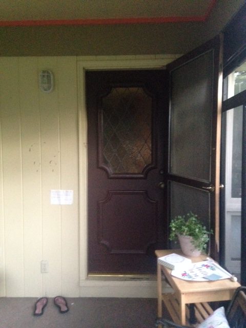
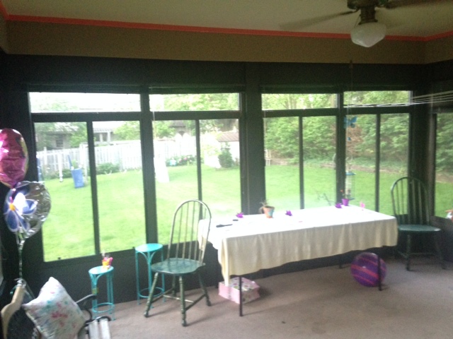
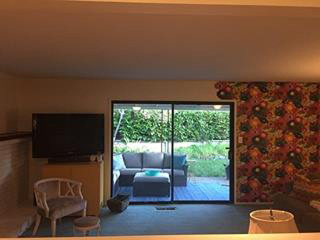
The opposite side has a beautiful glass slider to her outdoor living space.

There’s a nice blank wall to the back of the room.

Jenna didn’t give me much direction for the room, except that she wanted it to be light and bright.  That’s my favorite kind of room :). First off I gave everything a coat of fresh paint in Benjamin Moore’s Decorator’s White.  It is very light with a slight gray/green undertone.

To keep it from feeling too cold or plain, I added texture and warmth with wood pieces, linens, and colored sofas.  With a neutral sofa base and added color with fitted slip covers, she can enjoy the splash of color without committing long term on an expensive piece.

I moved her TV above the fireplace so she could add more seating. I recommend using a Pull-Down TV Wall Mountso it can still be viewed at eye level and pushed back and covered with the barn door sliders when company is over.  The sliders have magnolia wreaths for a touch of green.

I added a thicker mantle from distressed wood to better balance the size of her beautiful fireplace. Here’s a tutorial to do it on the cheap.  another similar tutorial And filled her fireplace with decorative birch logs.  If birch isn’t plentiful in her area, she can mimic the look by dry brushing white chalk paint onto regular logs.

I used curtains on the doors to add softness to the room.  Hanging them high and wide gives the illusion of taller ceilings.  It also covers blank  wall so Jenna won’t need as much art work.   Throw pillows turn the hearth into additional seating, perfect for gatherings with lots of kids.  And the ottoman can be used as a coffee table with the addition of a wooden tray to stabilize beverages or pulled to the side for even more seating.  I’ve seen ottomans this style with a lift up top for blanket storage inside.

Here you can see the impact of the curtains on the doors a little better.  They are hung all the way to the side, so they don’t interfere with door access.  I had trouble finding a blue sofa at just the right angle, but I recommend she pull it closer than she had her sofa before.  Just to the edge of the door area, for easier conversation and better TV viewing.

Since pulling the sofa closer will leave her blank wall with a gap (I’m guessing there will be 3-4 feet behind the sofa.)  She will have room to install bookcases floor to ceiling with classic crown molding. This explodes her storage potential while still giving room for someone to walk behind the sofa and select a book for reading.  Bookcase photo and tutorial from Centsational Girl.

Finding the right angle of sofa in the right colors was a big challenge. That’s why all the blues are a little different, but you get the idea.  I like having one in a lighter shade of blue than the other, to keep the space from feeling too matched.  With the curtains, sliders, and bookcase, there’s only one place for artwork left.  I think Jenna should make it ONE big piece that she loves.  I put this watercolor piece in for an example, but she could do anything, even paint something abstract herself.

I noticed Jenna had a nice bold green in her kitchen, so wanted to show her what it would look like if she decided to go with Green instead of blue.  (She’d have to pick out different curtains.)

Just for giggles, here are some side by side photos for you.

Additional Sources:

Would you like your room photoshopped and featured on Makeover Monday?  Send a few photos from your space to angela@groceryshrink.com and tell me your hopes and dreams for the room.  It’s free 🙂 

Get a full service virtual makeover complete with 3D room layout plan, 2 photoshop views, step by step work list, and source list–all in your budget. Find out more.

room-makeover-short-banner

Learn how to use Photoshop your own designs with the Room Makeover class.

Post contains affiliate links.